How Laurie Rowan made a cutesy curmudgeon
With its new work for Telstra, Nexus Studios has given us the most precious pessimist in recent memory. We caught up with director Laurie Rowan to find out how character design and vocal performance can sell such a sweet idea.
)

How did you approach the scripts and creative direction for this campaign?
Our collaboration with the Telstra was great.
The client and agency [+61 and Bear Meets Eagle On Fire] were very keen to maintain the tactility and humour they’ve established in their previous campaigns and came in with a very strong sense of what they were looking to create.
It was a great balance for us as the infrastructure was all there, no guesswork, so it was just building on what they’d provided and trying to maximise the potential of the subtleties of the humour and really boiling down the storytelling for maximum impact.
What advantages did 3D/CG bring to the production?
I think the primary thing 3D/CG gave us was control. Colin and his environment are deceptively simple, but there are a lot of micro-expressions and tonal shifts that we had to accommodate. Our CG pipeline allowed us the luxury of assessing what was working and what wasn’t working efficiently, doing multiple iterations. It was a fast turnaround project, so this level of control and adaptability was necessary.
Colin and his environment are deceptively simple, but there are a lot of micro-expressions and tonal shifts that we had to accommodate.
The other benefit was that it allowed us to cherry-pick which aspects from the world of stop motion and puppetry we wanted to incorporate into our visual language. The calibre of our modellers, texture artists, riggers, lighters and compers meant that we were totally confident we could maintain a tactility that was consistent with the previous in-camera Telstra campaigns.
Another way it informed our approach was to make sure we foregrounded the mechanical aspects of Colin and his clock. We wanted the audience to feel his constraints and range of motion and incorporate that into the joke.
There’s a satisfying quality to seeing how much performance can be drawn from a simple tactile structure when you have a full awareness of its construction.
Credits
View on- Agency Bear Meets Eagle on Fire/Sydney
- Production Company Nexus Studios/UK
- Director Laurie Rowan
-
-
Unlock full credits and more with a shots membership
Credits
View on- Agency Bear Meets Eagle on Fire/Sydney
- Production Company Nexus Studios/UK
- Director Laurie Rowan
- Ad Agency +61/Sydney
- Executive Producer Rachel Moss
- Producer Lizzie Small
- Art Director Melanie Climent
- Editor David Slade
- Animation Nexus Studios/UK
- CG Supervisor Mark Davies / (CG Supervisor)
- Lead 3D Animator Marylou Mao
- Character Design Laurie Rowan
- Sound Rumble Studios
- Chief Creative Officer Micah Walker
- Creative Director Chris Cheeseman
- Creative Director Doug Hamilton
- Design Creative Director Mike Witcombe
- Producer Renee Nadin
Explore full credits, grab hi-res stills and more on shots Vault

Credits
powered by- Agency Bear Meets Eagle on Fire/Sydney
- Production Company Nexus Studios/UK
- Director Laurie Rowan
- Ad Agency +61/Sydney
- Executive Producer Rachel Moss
- Producer Lizzie Small
- Art Director Melanie Climent
- Editor David Slade
- Animation Nexus Studios/UK
- CG Supervisor Mark Davies / (CG Supervisor)
- Lead 3D Animator Marylou Mao
- Character Design Laurie Rowan
- Sound Rumble Studios
- Chief Creative Officer Micah Walker
- Creative Director Chris Cheeseman
- Creative Director Doug Hamilton
- Design Creative Director Mike Witcombe
- Producer Renee Nadin
How was Colin’s character design developed to reflect his personality and role?
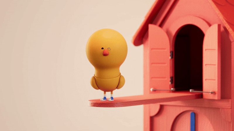
Colin was always defined by his reluctance, so our first consideration was to create a character that could carry that persona, but also have an initially cute appearance to subvert expectations. We designed him through a series of very practical considerations. Asking ourselves how much real estate and range of motion is required to hit just the right range of expression, we need to sell his discontent and at times surprise.
The scripts lead the first stage of this, giving us a blueprint of the requirements, then we looked at what real-world stop motion and puppetry equivalents would be most appropriate to telegraph each aspect. This is how Colin ended up having very contrasting dimensions; a massive head to frame his small, simple, readable face, little legs to underplay his self-importance as he attempts to stomp and dominate his space and distilled forms for his wings that could perform many gestures with little adaptation.
We chose the replacement method for his mouth and eyes, and these were the elements that required a further level of adaptability and expression.
What was the thinking behind Colin’s wardrobe choices?
Colin’s wardrobe was essentially his shoes and socks. We went through a few versions, and for a while he favoured a Cuban heel. Perhaps this felt too decadent.
In order to appear naked, the concept of clothes has to exist in his world.
One thing that was solid in our minds from the off was that in order to appear naked, the concept of clothes has to exist in his world. Wearing shoes, and most definitely socks, is the most naked you can appear while wearing something.
The nipple rings are just pure self-expression, like seeing a teacher outside of school wearing a bandana. Colin has an external life, and he wants you to be intrigued by it.
How important was the character’s physicality in delivering the humour?
When designing Colin, the scripts gave us such a good indication of who he is. Our interpretation was that he is fundamentally small, with grandiose ambitions that are most probably unearned. This resulted in him being very literally big-headed, to give him presence but also to allow his legs to be small and undignified by comparison. The decision to anchor his legs from the base of his pelvic bowl with no ability to bend meant that he would always have to walk and manoeuvre with an undignified slapping motion, something I particularly enjoyed.
The adverts are very short and at times consist of quite stark emotional shifts between anger, pride and disappointment. For the benefit of legibility and impact, we decided that his eyes had to snap between states and convey as much as possible in the fewest strokes. The aspect that I’m most proud of is that we gave his wings a sweeping form. We wanted his silhouette to be like that of an actor in a grand regency drama with billowing sleeves, so that a sweep of an arm (wing) would have an embedded theatricality.


How did you refine the vocal performance to fit the character’s tone?
That was a fair amount of back and forth with the voice actor. Very quickly, the agency settled on a great deadpan persona. From there, we shaped the performance over a couple of sessions. The pieces are so succinct that we had to make sure that every frustrated intake breath and point of emphasis really carried its weight and conveyed a naturalism.
At times, I think this was frustratingly dictatorial and repetitive for the actor, but to be honest, I think that helped achieve Colin’s aggravated persona through method acting.
How was sound design used to enhance the comedy and support the visuals?
Our approach to sound design was certainly less is more. Just enough peripheral sound to help things feel physically real without becoming dominant. So the rule was to only include aspects that reinforce what we are seeing. Pacing certainly falls into that bracket, too. We relied on a lot of pregnant pauses, then undercut them with pronounced tonal shifts.
The pieces are so succinct that we had to make sure that every frustrated intake breath and point of emphasis really carried its weight and conveyed a naturalism.
People are naturally scared of silence, and I think it gives the ads a unique tone that aids the whole thing in feeling like a fourth wall break. The final SFX that accompany the end cards were an addition from the agency, and I love how they give a lighthearted full stop to each spot.
Were there any standout moments or individuals from the production that you want to highlight?
In all honesty, I think everyone on this project deserves a shout-out.
It ran so smoothly, and we were a close team that all understood what we were trying to achieve. Remove one element, and it wouldn’t have worked.
Mark Davies kept the whole thing together with his clear instructions, problem-solving and attention to detail. Melanie Climent made it beautiful, defining a completely consistent aesthetic and making sure everything remained in line with that vision. Marylou Mao understood exactly the distilled motion language we were going for and made sure this was conveyed to everyone in the clearest terms possible. Hen Levene nailed the translation from 2D to a rich real-world 3D equivalent immediately and gave us all confidence that this was going to work.
Lizzie Small, Ruyi Meer and Tyler Antin kept the whole thing on rails, acting fast and averting any delays or confusion that we did not end up experiencing as a result of their guiding hands. Alina Bopele, Juan Chaparro, Marta Pevida and Will Lorton turned out hilarious, well-observed animation time after time.